Proto v3
-
About the project
Proto is an AI-powered chatbot creation web app with customer relationship management, livechat, and ticketing capabilities.
I was on a team of 2 other designers as well as the Head of Product to completely redesign the platform in 3 weeks (a v3).
Our main goals were to improve overall usability and navigation, update to a more modern and clean UI, and incorporate new productivity-enhancing ChatGPT add-ons.
-
My role
UX/UI Designer
01
Understanding the goals
Before we began brainstorming, we first needed to understand the user needs and business goals for this project.
User needs
To understand our users’ needs and painpoints, we collaborated closely with the customer experience (CX) team who collected user feedback and analyzed trends. Our Head of Product also met with users in person and was able to collect valuable insights into the issues they faced, both large and small. Using these insights together with our own understanding of usability principles, we narrowed down the issues that had the largest impact and required prioritization.
We found the main issues to be:
1) Unclear navigation. In v2, there was an unnecessary amount of subpages within each module (i.e. Chatbot builder, livechat, tickets, etc.). Without clear breadcrumbs, it was easy to get lost within these pages and forget where you are and how you got there.
2) Inconsistent component behaviours. It was difficult to learn the platform due to a lack of consistency regarding component functionality.
3) Lack of automation and tedious steps. Filling out multiple fields for creating customer and company member profiles, tickets, etc. was a nuisance due to the lack of automation. Everything had to be created and saved manually, and with each module having it’s own settings page (rather than having all settings located in one location) it was a tedious task to find what you were looking for.
Business goals
To understand the business goals of this project we spoke with senior leadership. From those meetings we created a list of Must-Haves (non-negotiable items) and Nice-To-Haves (lower priority items that, depending on capacity, could be reserved for later releases).
These goals included:
1) Incorporating ChatGPT add-ons. Senior leadership wanted to introduce productivity-enhancing add-on’s utilizing ChatGPT to stand out from competitors. This included features like auto-summarization of livechat conversations and mood detection.
2) Increasing customer satisfaction and sign up conversion rates. The over-arching goal for stakeholders was to improve current user satisfaction by fixing usability issues and updating the UI, and increase the amount of new users registering for paid accounts.
Now that we understood the goals for the project, we moved onto research and ideation.
02
Research and planning
I conducted competitive research and compiled my screenshots and notes into a Figjam file that I then shared with the team. I was looking for industry trends, patterns, pain points, and opportunities for us to differentiate from our competitors.

Once my team and I went over my observations, we started brainstorming ideas for the UI and moved onto the planning portion of the process.
I then made task flows and a detailed sitemap to plan out the basic structure and hierarchy of v3.

An example of one of the task flows made for v3.
03
Wireframes
Once we had a plan for how the content was going to be organized and established basic flows for how users would accomplish their tasks, we started creating wireframes to share with the rest of the team for initial feedback as well as to update them on our progress.
I created wireframes for both larger displays (as most of our users used 27” monitors) and medium displays, with the plan to add mobile later on. We wanted to make v3 fully responsive and that started here.

Here you can see a screenshot of some of the wireframes, alongside notes describing insights and design rationale.
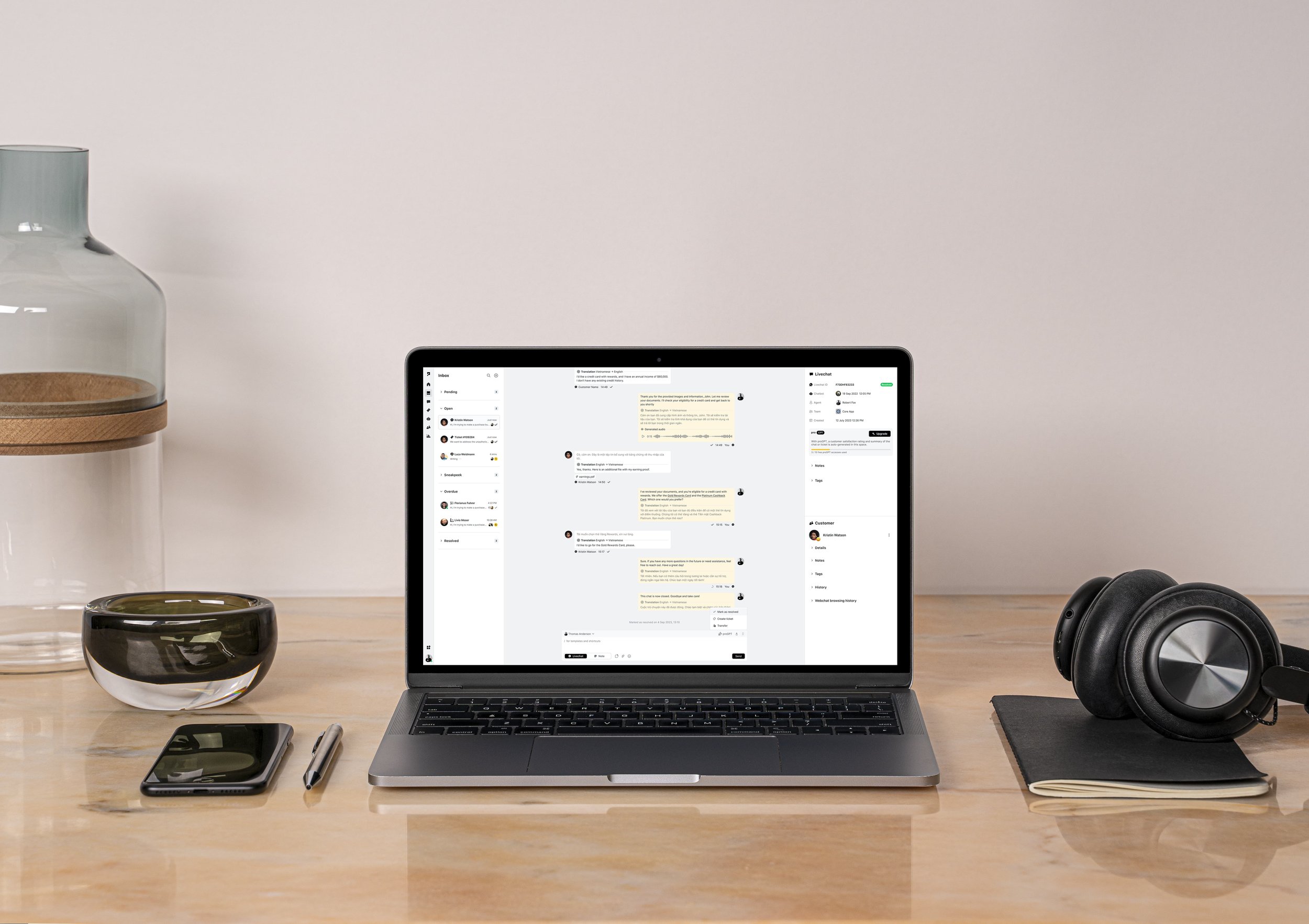
One issue we found with the livechat and ticketing interface for v2 was that users were tired of having to switch back and forth between two different modules when creating tickets from livechats. The livechat function and ticketing system were separate from one another, so if an agent wanted to create a ticket from their livechat conversation they had to leave the chat and navigate to the tickets page where they would then create the ticket.
As a part of our goal to enhance the overall usability of the platform, we combined the tickets and livechat pages together and created the Inbox: a central location for all customer communication. Originally, we decided to go a step further and combine all ticket correspondence (which utilized email) and livechat conversations together into one thread for each customer. This allowed the entire conversation history for each customer to be viewed at once, with agents able to switch between email and livechat channels via the text editor.

The conversation history was “chunked” to separate the ticket emails from livechat conversations. Depending on which section was selected, the right panel would update to display the details of either the chat or the ticket. When reaching out to customers, agents could select the channel they wanted to utilize from the text editor.

This idea proved to be problematic. During feedback sessions there was confusion about how exactly it worked, and the development team emphasized it’s technical complexity and raised concerns about a time-consuming implementation. Because of this, we decided to pivot the design direction and instead separate all livechat and ticket conversations. They were still all located in the Inbox, so we knew it was a usability improvement - and the customer history was still easily found within the customer panel.
Once we finished implementing the necessary changes, we moved onto creating high-fidelity mockups and prototypes using the PrimeVue UI kit to speed up the UI design.

Final designs
User need: clear navigation
To alleviate the usability issues caused by v2’s poor navigation, we greatly reduced the amount of subpages within the platform. Instead of having multiple settings pages buried within each module, we combined all profile, company, chatbot, livechat, ticket, and add-on settings into one core page. Users would no longer have to hunt for what they need, now being able to find it easily using the improved UI.

User need: automatic saving and simplified steps
We simplified the steps needed to create tickets and livechats, using automatic saving throughout the platform. This allowed users to complete their tasks faster, and with less clicks.

User need: consistent component behaviour
Because we used the PrimeVue UI kit to construct our designs, we were able to expedite the UI design process and meet our deadline. By using a UI kit we also ensured that component interactions and behaviours were consistent across the board.
Business goal: incorporating ChatGPT add-ons and improving user satisfaction
The most important add-on we introduced was the addition of ChatGPT productivity-enhancement features. This included:
Writing correction and modification
Tone detection and modification
Translation capabilities
Chat summarization and mood detection
These allowed agents to streamline their workflows while empowering them to provide outstanding customer support.


