Tiny Bites
-
About the project
Tiny Bites is a passion project conceived by developer and first time mom, Stephanie Snopek. An informational website, Tiny Bites offers new parents easy-to-follow feeding tips and tricks, nutritional facts backed by expert resources, as well as numerous easy recipes for infants ages 0-12 months.
I was tasked with redesigning the existing site and branding. The goal was to make the site feel more cohesive and professional, as well as improving the readability and navigation for busy parents on the go!
-
My role
Sole UX/UI Designer
01
Content analysis

Overall, I found it difficult to quickly scan the content because of a lack of hierarchy and organization. On the meals and recipes section, meal list items were centre-aligned with no discernible markers such as numbers or bullet points. Recipe items were arranged in a paragraph rather than list form, making it more difficult to read. Instead of ingredients and instructions being listed separately, everything was arranged together making the user have to hunt for specific information.
The links were also unrecognizable at first glance, being only a slightly different shade of grey than the rest of the text (shown here at the bottom of the recipe page).

I also noticed a lack of bread crumbs and navigation markers throughout the site. Here you can see two separate pages of the site, with the top being the “Baby Nutrition” page and the bottom photo being the “Easy Meals” page. However, there is no way of knowing where you are on the website by looking at it. With no page headers or markers on the selected navigation links (such as underlines or bolded letters), it’s easy to get lost and confused as to what page you’re on as you’re scrolling through the content.
Pain points:
1) Readability
Because of the lack of hierarchy and structure, it makes the content harder to read and causes the user to hunt for relevant information.
2) Navigation
Without page headers or markers on selected navigation links, it’s easy to get confused as to where you are on the website.
02
Planning and wireframes
After analyzing the content and figuring out the pain points, I crafted a new userflow and sitemap to plan out the reorganization of the website.


Because of the content-heavy nature of the site, I wanted to make sure all of the information was organized in a way that makes sense to the user while prioritizing important content. I decided to add the feeding safety information to the meals page so that any parent looking for the recipes would first see important information on allergies and choking risks.

03
Visual identity
Once I had a plan for how the site was going to be organized and a rough page layout, I moved onto designing the colour palette, logo, and curating new site images.

I wanted the UI design to match Tiny Bite’s theme of wellness and health, while keeping it fairly minimalistic. I used a more playful font and icon for the logo to keep in theme of childhood and wellness. For the colours, I simply adjusted the existing colour scheme to be more cohesive and added some pastels to give it a softer look and feel.

Final designs
I made sure to continuously return to the pain points of readability and navigation during the design of the final screens, and here you can see my solutions.

Readability
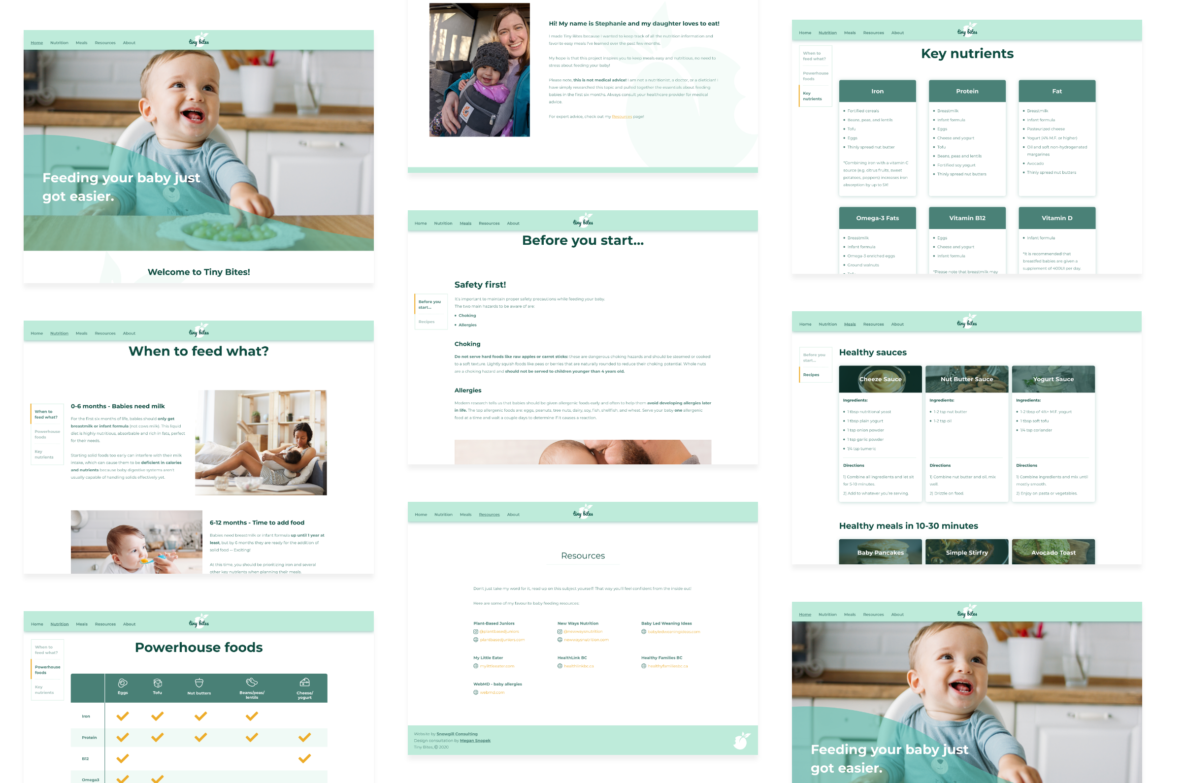
I changed the page layouts throughout the site, increasing the spacing between sections. I increased the size of secondary and tertiary headers to break up the information into bite-sized portions (pun intended) that the user can more easily scan.
I also converted the recipes into cards, with the ingredients and directions separated. This allows the user to instantly recognize the content as a recipe where they can easily find information on ingredients and amounts instead of hunting for them in paragraphs.


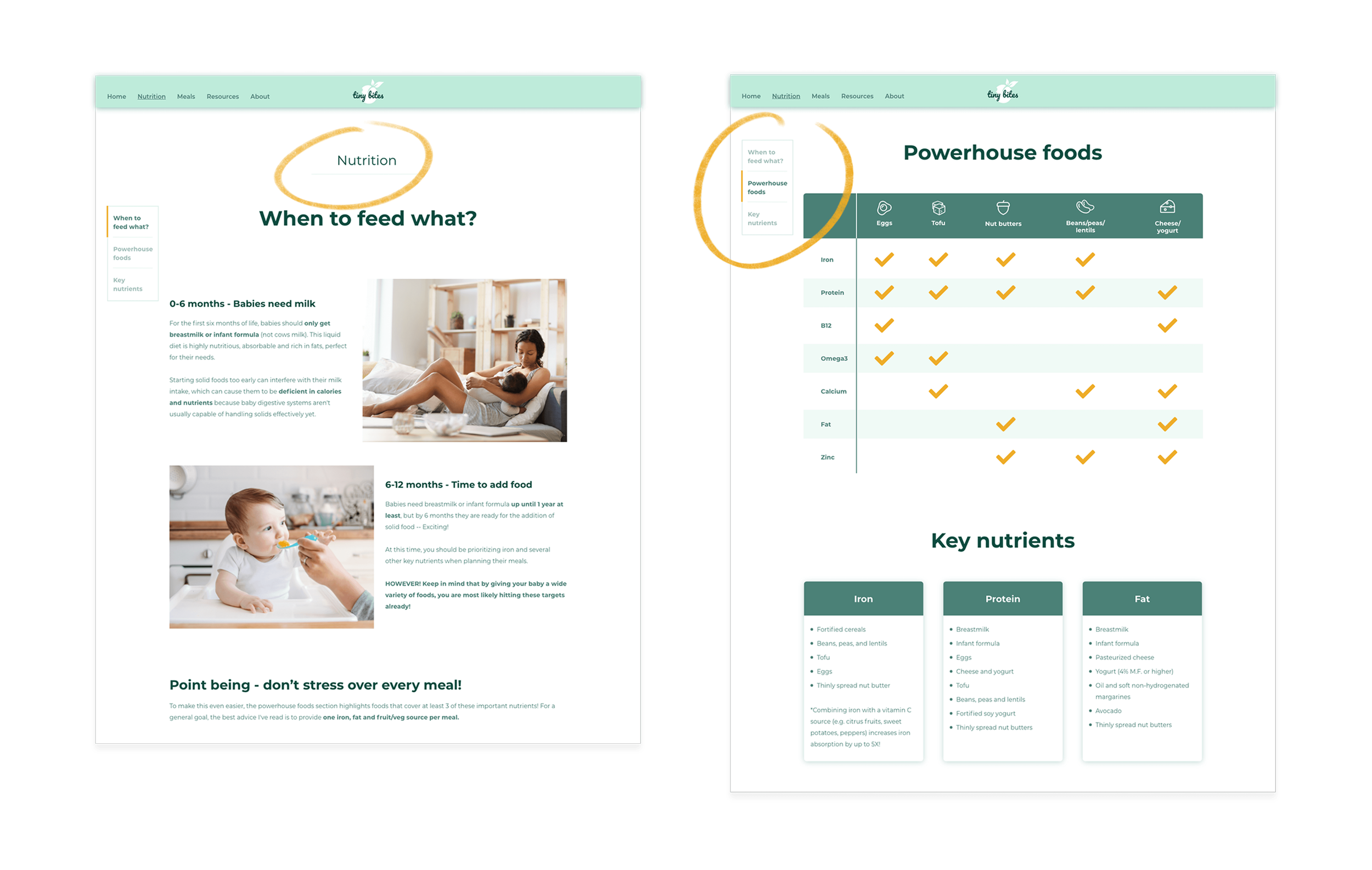
For the powerhouse foods, I converted them into a table so that the user can easily see which foods contain the necessary nutrients.

I updated the colour of the links to be a butter yellow (matching the brand colours) so that throughout the site, and particularly on the resources page, it’s easy for the user to differentiate between links and regular text.
Navigation
To solve the issue of navigating throughout the site, I added page headers that match the labels within the header so that the user never has to question where they are on the site.
Because of the amount of content, I decided to add a fixed page index on the left side of the nutrition and meals pages. With this, the user can see an overview of what content can be found on the page as soon as they open it, and they’re able to quickly jump to different sections if they’re searching for specific information.